Humanity’s Accessibility Journey: A VPAT-Based Evaluation for WCAG compliance
Humanity’s Accessibility Journey: A VPAT-Based Evaluation for WCAG compliance
I joined TimeClock Plus (TCP) as a product designer in Q3 2024 and was assigned to Humanity, their core employee scheduling product. At the time, the team was preparing for a major release. One of my initial key projects was to enhance Humanity’s accessibility in alignment with the WCAG and to document this conformance by updating design and completing a VPAT Template . What began as an accessibility initiative soon evolved into a broader effort to improve usability and establish a consistent design system.
I joined TimeClock Plus (TCP) as a product designer in Q3 2024 and was assigned to Humanity, their core employee scheduling product. At the time, the team was preparing for a major release. One of my initial key projects was to enhance Humanity’s accessibility in alignment with the WCAG and to document this conformance by updating design and completing a VPAT Template . What began as an accessibility initiative soon evolved into a broader effort to improve usability and establish a consistent design system.
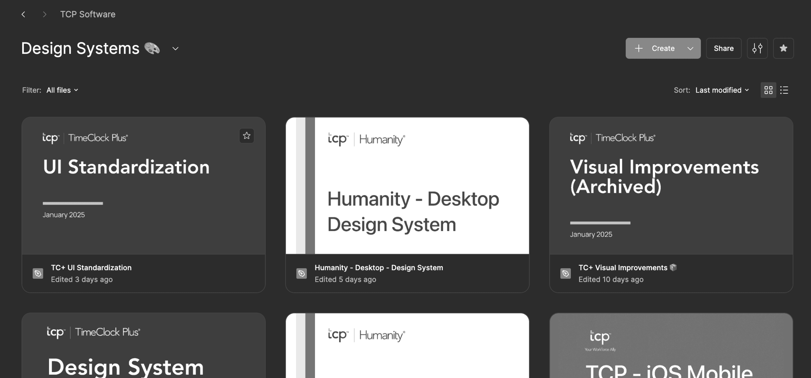

A glimpse at the design system files — fun fact: most are proudly deprecated. 😅
A glimpse at the design system files — fun fact: most are proudly deprecated. 😅
Initial Observations
Initial Observations
Humanity had an existing design system, but it lacked proper documentation and alignment between design and development. Developers often reused legacy components without adhering to a consistent design language, and the system lacked a well-structured approach to managing colors, typography, spacing and components. This fragmented ecosystem became an opportunity to introduce structure, consistency, and accessibility.
Humanity had an existing design system, but it lacked proper documentation and alignment between design and development. Developers often reused legacy components without adhering to a consistent design language, and the system lacked a well-structured approach to managing colors, typography, spacing and components. This fragmented ecosystem became an opportunity to introduce structure, consistency, and accessibility.
Component Bank
Component Bank
To bridge the gap between design and development, I began by auditing all existing components in the dev environment. I created a component bank that documented every UI element currently in use. From there, I curated a subset of high-quality components—input fields, buttons, dropdowns—and made subtle refinements to ensure consistency in color and typography. These components formed the foundation of our renewed design system.
To bridge the gap between design and development, I began by auditing all existing components in the dev environment. I created a component bank that documented every UI element currently in use. From there, I curated a subset of high-quality components—input fields, buttons, dropdowns—and made subtle refinements to ensure consistency in color and typography. These components formed the foundation of our renewed design system.
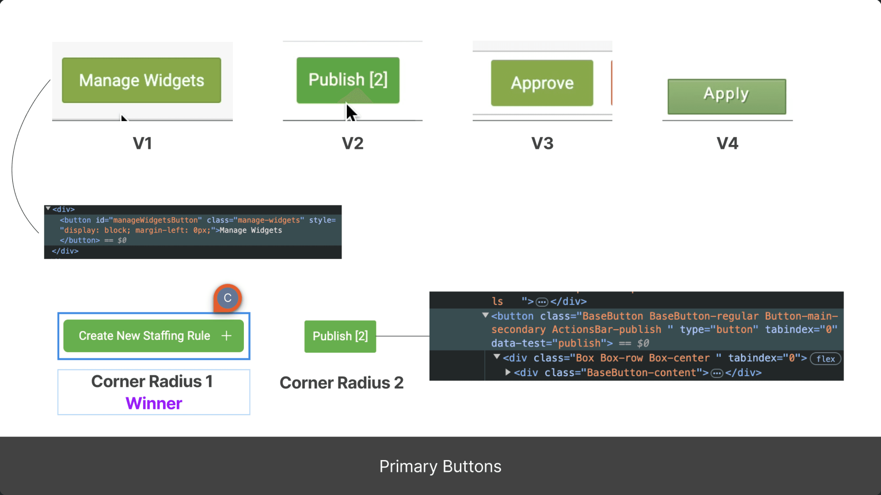
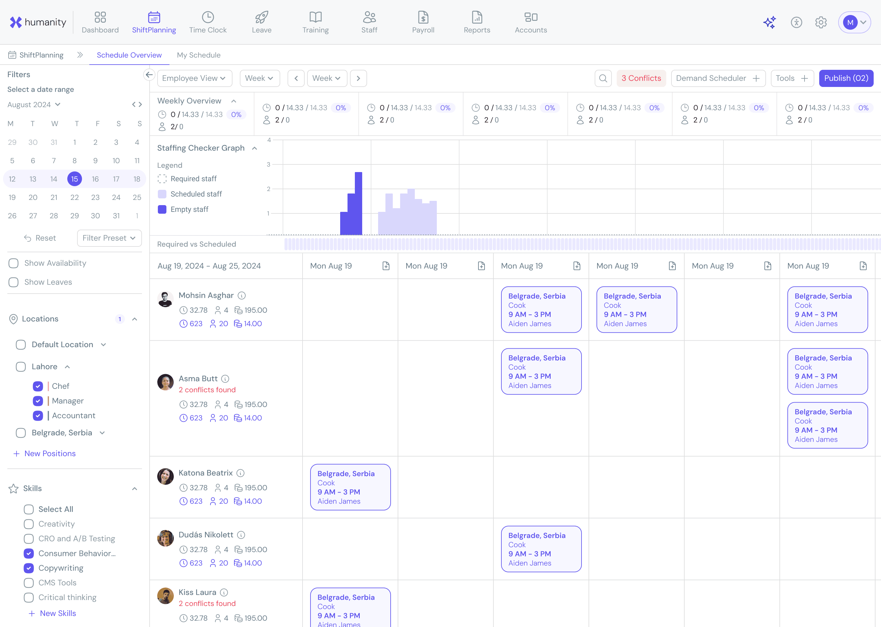
Checked all primary buttons in Humanity — surprise, they barely match!
Checked all primary buttons in Humanity — surprise, they barely match!
Color Accessibility and High Contrast Mode
Color Accessibility and High Contrast Mode
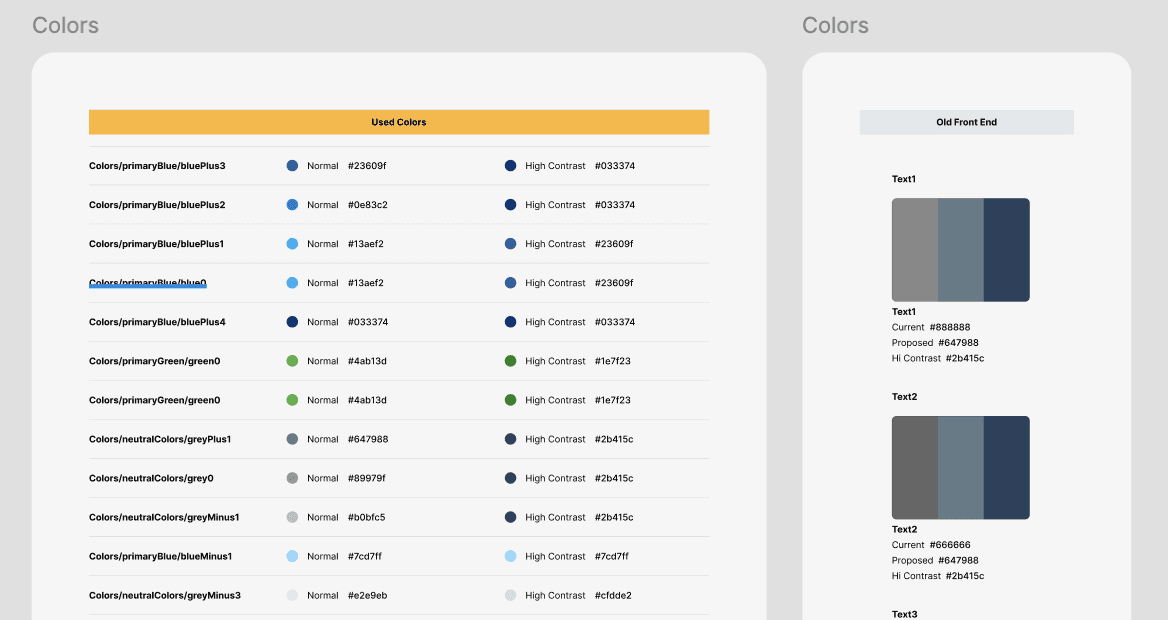
One of the first things I noticed was the inconsistent use of color across the product. There were multiple shades being used for the same purpose—especially for text—with no structured system in place. To address this, I initiated a cleanup and redesign of our color variables.
Working closely with the PO, I asked the developers to share a complete list of the color variables being used in the codebase. The list confirmed my initial observation: a cluttered mix of redundant values without clear naming or hierarchy.
To bring structure, I took the following steps:
To bring structure, I took the following steps:
Primitive Tokens
From the list of existing variables, I curated a clean set of foundational values—our primitive tokens. These included all used colors. Every primitive token had two values:
One for Normal Mode (standard UI)
One for High Contrast Mode (for accessibility)
Primitive Tokens
From the list of existing variables, I curated a clean set of foundational values—our primitive tokens. These included all used colors. Every primitive token had two values:
Normal Mode: Soft, visually pleasing colors that maintained sufficient contrast and visual consistency
High Contrast Mode: A fully WCAG AA/AAA-compliant theme designed for users with visual impairments. I used Figma accessibility plugins to simulate various vision conditions and fine-tuned the palette accordingly.
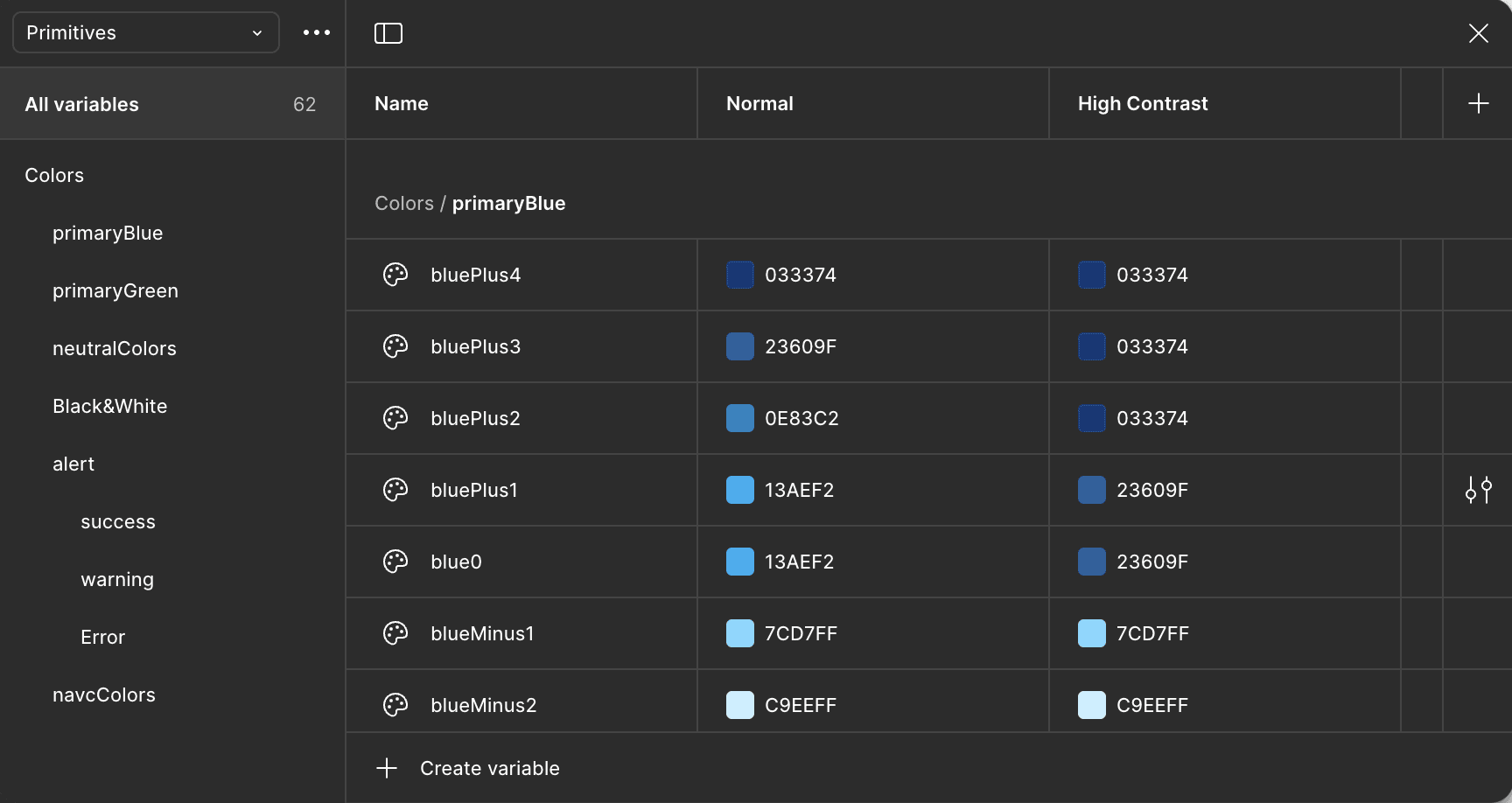
A glimpse of definition of primitives variables in Figma
A glimpse of definition of primitives variables in Figma
Semantic Tokens
Using the primitive set, I defined a semantic layer—tokens with specific design purposes like text-primary, bg-surface, or border-main. This helped standardize how color was applied across components and ensured designers and developers were speaking the same language.
Semantic Tokens
Using the primitive set, I defined a semantic layer—tokens with specific design purposes like text-primary, bg-surface, or border-main. This helped standardize how color was applied across components and ensured designers and developers were speaking the same language.
I implemented these tokens into Figma, building two distinct themes:
Normal Mode: Soft, visually pleasing colors that maintained sufficient contrast and visual consistency
High Contrast Mode: A fully WCAG AA/AAA-compliant theme designed for users with visual impairments. I used Figma accessibility plugins to simulate various vision conditions and fine-tuned the palette accordingly.
This wasn’t just a switch to browser defaults—it was a deliberate, detail-oriented solution tailored to our product and users.
This wasn’t just a switch to browser defaults—it was a deliberate, detail-oriented solution tailored to our product and users.
Usability Improvements
Usability Improvements
Labeling: Many text fields, dropdowns, and filters lacked labels. I initiated a process to ensure all interactive elements had proper labels, greatly improving screen reader compatibility.
Tooltip and Descriptions: I found many icons and buttons without contextual help or descriptions. These were documented and revised to improve clarity.
Modals and Interaction Contexts: Some features relied on modal windows when full-page views were more appropriate. We flagged and redesigned these workflows for better interaction logic.
Keyboard Navigation: We audited the product for keyboard-only usability and worked on implementing proper tab flows, focus states, and keyboard triggers.
UX Copy and Microcopy: Accessibility isn’t only technical; it’s also linguistic. I reviewed UX copy throughout the app to ensure that language was clear, meaningful, and actionable, improving the user experience for everyone.
Outcome and Impact
Outcome and Impact
What began as a compliance initiative soon became a foundational design system project. By Q4 2024:
What began as a compliance initiative soon became a foundational design system project. By Q4 2024:
We successfully achieved VPAT based evaluation for accessibility.
We established a shared visual language between designers and developers.
We introduced accessible color systems and components with documented behavior.
We initiated long-term efforts to improve UX copy, interaction clarity, and overall product usability.
1- We successfully achieved VPAT based evaluation for accessibility.
2- We established a shared visual language between designers and developers.
3- We introduced accessible color systems and components with documented behavior.
4- We initiated long-term efforts to improve UX copy, interaction clarity, and overall product usability.